Understanding your users
last week was the first time i ever paid for an online service. true, i paid for ESPN Insider before, but that's not so much a service as it is a personal necessity like food (i guess it is a service too :) ). of course i've paid for products online (amazon.com, etc.), but never a service. my reasoning? there are so many free services available that i just find it infuriating when a web service can't figure out a business model to keep itself afloat without charging me.
last week though, i purchased a flickr pro account. the reason? they forced me into it! they forced me into it by providing a service that i found so fantastic that when i hit the monthly upload limit for free accounts, i thought to myself: "you need to spring for the $2/month so you can upload all those europe photos." (short aside: when i returned from europe in july of 2004 i wanted to post all of my photos online to share with people, but i never did it because all of the photo sites had poor sharing features or wanted people to sign up for their service to get access to the shared photos. i thought that was total horseshit. not bullshit, horseshit.) kudos to flickr for sucking me in.
so the next question is, of course, why did i find the service so fantastic? as a product manager and a product designer, i find myself constantly thinking, "this product/service/widget is completely shit/wonderful because..." for flickr, it's the ease of use (which is how an online photo sharing site should be) and the carefulness of their design decisions. they really know their users. my favorite example of this is a tiny little option that you, if you're a flickr user, may not have even noticed. on the Organize page, there is a tiny checkbox:
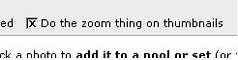 i looked at this checkbox, read the text again, and had to smile. everyone knows what the "zoom thing" is. when you mouseover a thumbnail, the interface automatically zooms into the photo so that you get a better view. i mean, it's the zoom thing. the thing where it zooms. how do you explain the zoom thing in ten words or less and in text that everyone can understand? i mean, it's the 'zoom thing', but we can't call it that, can we? we could call it 'thumbnail zoomer' but that's making up a word and not exactly descriptive. we could call it 'zoom on thumbnails when mouse pointer is over the thumbnail' but that would be ridiculous.
i love the decision by them to just call it "zoom thing" because it represents an understanding of their users. flickr users are casual and friendly. they want a casual and friendly application that works with them. if i was labeling a similar feature in Customers Online, there is no way in hell that i would ever call it the "zoom thing". our users are behemoth corporations and IT departments who would scoff at the colloquial text. "zoom thing". good for flickr, not good for oracle.
yeah, maybe the "zoom thing" text was just flickr being lazy, but i kinda believe that it wasn't. i think they actually sat down and thought the labeling of the checkbox through. maybe they started out with it as "zoom thing" with the intent of changing it and realized that there's just really nothing better for their users and their appliation. that's good design, recognizing what your users want and need, and delivering it without complicating it.
i looked at this checkbox, read the text again, and had to smile. everyone knows what the "zoom thing" is. when you mouseover a thumbnail, the interface automatically zooms into the photo so that you get a better view. i mean, it's the zoom thing. the thing where it zooms. how do you explain the zoom thing in ten words or less and in text that everyone can understand? i mean, it's the 'zoom thing', but we can't call it that, can we? we could call it 'thumbnail zoomer' but that's making up a word and not exactly descriptive. we could call it 'zoom on thumbnails when mouse pointer is over the thumbnail' but that would be ridiculous.
i love the decision by them to just call it "zoom thing" because it represents an understanding of their users. flickr users are casual and friendly. they want a casual and friendly application that works with them. if i was labeling a similar feature in Customers Online, there is no way in hell that i would ever call it the "zoom thing". our users are behemoth corporations and IT departments who would scoff at the colloquial text. "zoom thing". good for flickr, not good for oracle.
yeah, maybe the "zoom thing" text was just flickr being lazy, but i kinda believe that it wasn't. i think they actually sat down and thought the labeling of the checkbox through. maybe they started out with it as "zoom thing" with the intent of changing it and realized that there's just really nothing better for their users and their appliation. that's good design, recognizing what your users want and need, and delivering it without complicating it.
posted by Jack Chou @ 4/06/2006 09:11:00 AM
![]()
![]()

1 Comments:
Hey! You went to Europe in 2004! And you STILL HAVE MY BACKPACK.
Post a Comment
<< Home