MY Homepage
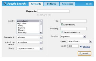
during the afternoon yesterday, i realized that my "my google" homepage was just not cutting it anymore. the reason? real estate. i understand that google's design goal is minimalism. for something like search, that just makes a lot of sense. compare google to the most broken search paradigm that i've come across lately (linkedin's People Search) and you realize how nice a single box on a search page is. here, take a look at how clumsy/confusing this is:
 but when it comes to a homepage, i want some density. it's MY homepage. i should be able to convolute the interface as much as i want. if i wanted to make nearly every pixel text, that should be fine.
with google, i reached the point where i just ran out of room. "ran out of room?" you ask. "how can you run out of room? can't you just scroll?" well, one of the most basic points of human-computer interaction is that you should never make the user scroll if you don't *have* to. stuff on the page that requires scrolling to view is referred to as "below the fold". and, like its traditional media counterpart, being "below the fold" on a website is ass. so, as i attempted to add my 30 boxes calendar onto google homepage, i ran into an issue:
but when it comes to a homepage, i want some density. it's MY homepage. i should be able to convolute the interface as much as i want. if i wanted to make nearly every pixel text, that should be fine.
with google, i reached the point where i just ran out of room. "ran out of room?" you ask. "how can you run out of room? can't you just scroll?" well, one of the most basic points of human-computer interaction is that you should never make the user scroll if you don't *have* to. stuff on the page that requires scrolling to view is referred to as "below the fold". and, like its traditional media counterpart, being "below the fold" on a website is ass. so, as i attempted to add my 30 boxes calendar onto google homepage, i ran into an issue:
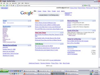 some of the problem is text size, but 1) there is substantial white space on the page that i really don't want, and 2) have you tried decreasing the text size on the google homepage? it doesn't look so hot.
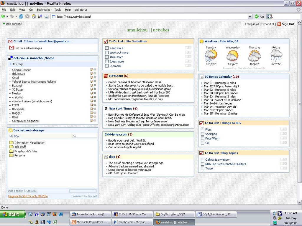
now, considering it's my homepage, i don't want ANY of the information to be below the fold, especially when there is all of that white space all over the damn page. so i went searching for a new homepage and finally settled on netvibes. i have to be honest: there is absolutely nothing that google homepage does that netvibes doesn't (well, except for Search History, but who gives an F about that?). the UI is just as slick. i personally think it looks nicer. it has integration with web e-mail providers (including gmail). it has integration with several other sites that i use excessively (del.icio.us and box.net). it has integration with several other sites that i intend to use excessively (flickr and writely). it has collapsibility of the sections.
and, most of all, it has SPACE. i've already put substantially more words on the page than i had on google, it's still very readable, and there's still more room. who knows what new things i'll be adding on there in the next month/years, but i think there will be enough space to arrange it on there.
some of the problem is text size, but 1) there is substantial white space on the page that i really don't want, and 2) have you tried decreasing the text size on the google homepage? it doesn't look so hot.
now, considering it's my homepage, i don't want ANY of the information to be below the fold, especially when there is all of that white space all over the damn page. so i went searching for a new homepage and finally settled on netvibes. i have to be honest: there is absolutely nothing that google homepage does that netvibes doesn't (well, except for Search History, but who gives an F about that?). the UI is just as slick. i personally think it looks nicer. it has integration with web e-mail providers (including gmail). it has integration with several other sites that i use excessively (del.icio.us and box.net). it has integration with several other sites that i intend to use excessively (flickr and writely). it has collapsibility of the sections.
and, most of all, it has SPACE. i've already put substantially more words on the page than i had on google, it's still very readable, and there's still more room. who knows what new things i'll be adding on there in the next month/years, but i think there will be enough space to arrange it on there.
 i think google minimalism is great for some areas, but i do feel like it just doesn't cut it everywhere (google finance). homepages is one of these places.
 but when it comes to a homepage, i want some density. it's MY homepage. i should be able to convolute the interface as much as i want. if i wanted to make nearly every pixel text, that should be fine.
with google, i reached the point where i just ran out of room. "ran out of room?" you ask. "how can you run out of room? can't you just scroll?" well, one of the most basic points of human-computer interaction is that you should never make the user scroll if you don't *have* to. stuff on the page that requires scrolling to view is referred to as "below the fold". and, like its traditional media counterpart, being "below the fold" on a website is ass. so, as i attempted to add my 30 boxes calendar onto google homepage, i ran into an issue:
but when it comes to a homepage, i want some density. it's MY homepage. i should be able to convolute the interface as much as i want. if i wanted to make nearly every pixel text, that should be fine.
with google, i reached the point where i just ran out of room. "ran out of room?" you ask. "how can you run out of room? can't you just scroll?" well, one of the most basic points of human-computer interaction is that you should never make the user scroll if you don't *have* to. stuff on the page that requires scrolling to view is referred to as "below the fold". and, like its traditional media counterpart, being "below the fold" on a website is ass. so, as i attempted to add my 30 boxes calendar onto google homepage, i ran into an issue:
 some of the problem is text size, but 1) there is substantial white space on the page that i really don't want, and 2) have you tried decreasing the text size on the google homepage? it doesn't look so hot.
now, considering it's my homepage, i don't want ANY of the information to be below the fold, especially when there is all of that white space all over the damn page. so i went searching for a new homepage and finally settled on netvibes. i have to be honest: there is absolutely nothing that google homepage does that netvibes doesn't (well, except for Search History, but who gives an F about that?). the UI is just as slick. i personally think it looks nicer. it has integration with web e-mail providers (including gmail). it has integration with several other sites that i use excessively (del.icio.us and box.net). it has integration with several other sites that i intend to use excessively (flickr and writely). it has collapsibility of the sections.
and, most of all, it has SPACE. i've already put substantially more words on the page than i had on google, it's still very readable, and there's still more room. who knows what new things i'll be adding on there in the next month/years, but i think there will be enough space to arrange it on there.
some of the problem is text size, but 1) there is substantial white space on the page that i really don't want, and 2) have you tried decreasing the text size on the google homepage? it doesn't look so hot.
now, considering it's my homepage, i don't want ANY of the information to be below the fold, especially when there is all of that white space all over the damn page. so i went searching for a new homepage and finally settled on netvibes. i have to be honest: there is absolutely nothing that google homepage does that netvibes doesn't (well, except for Search History, but who gives an F about that?). the UI is just as slick. i personally think it looks nicer. it has integration with web e-mail providers (including gmail). it has integration with several other sites that i use excessively (del.icio.us and box.net). it has integration with several other sites that i intend to use excessively (flickr and writely). it has collapsibility of the sections.
and, most of all, it has SPACE. i've already put substantially more words on the page than i had on google, it's still very readable, and there's still more room. who knows what new things i'll be adding on there in the next month/years, but i think there will be enough space to arrange it on there.
 i think google minimalism is great for some areas, but i do feel like it just doesn't cut it everywhere (google finance). homepages is one of these places.
posted by Jack Chou @ 3/21/2006 11:44:00 AM
![]()
![]()

2 Comments:
you need to add some stock market data to your home page. dont you want to know what the dow/s&p/nasdaq are doing?
Well, just get a higher resolution monitor. If I were you I'd be more alarmed by the item on your calendar that's not in chronological order. And as myself, I'm alarmed that you're going to an event/place called "Sweet 16". You people make me sick.
Post a Comment
<< Home